EasySPEAK Mobile App.
A mobile app that enables Toastmaster club members to engage in public speaking and leadership roles.
Easy-SPEAK is a web-based tool that allows Toastmasters club members to manage their meetings and track their communication and leadership development based on the Toastmasters International Educational Curriculum. Members can access their automated agendas for their club meetings and instantly sign-up for roles that count towards completing their designations.

Platform
Native mobile
Project duration
Jul. 15-28, 2018
Jul. 15, 2019 – March 20, 2020
Tools used
Adobe Creative Cloud/Suite:
Adobe Illustrator
Adobe Photoshop
Axure
Sketch

The challenge
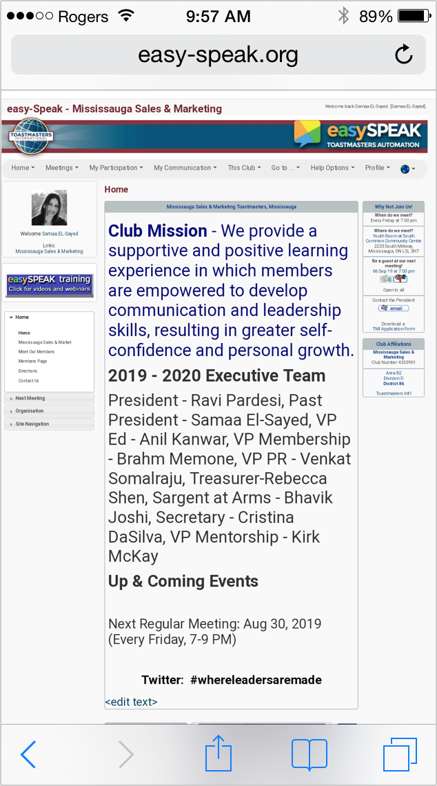
Accessing the platform from a browser, I noticed several pain points that hindered my user goals as an active Toastmaster member in my club. One of the major ones is that the current interface is outdated that isn’t mobile-friendly. Hence, I primarily focused on this question:
“How can I design EasySpeak in a way that it can provide a seamless user experience optimized for mobile devices for which users can access this platform anytime and anywhere?”
The goal
To provide a seamless user experience optimized for mobile devices for which Toastmaster International club members can access this platform anytime and anywhere.
Measuring success (KPIs)
If Toastmasters International decides to roll out this version of EasySpeak someday, the following metrics are what I would recommend for the organization to measure success:
Success task rate:
To ensure club members are confirming their roles and setting their Pathways goals.
Conversion rate and maintaining active/returning users:
As more members join Toastmasters, this would help with the conversion rate of EasySPEAK. After users sign up for an account, measuring the number of active users is paramount when they use the product on a regular basis.
User satisfaction:
If members in a club are satisfied with using this product, it is highly likely they would recommend it to other clubs, which would result in higher sign-ups and usability of the product.
End users
EasySPEAK is used by Toastmasters International club members who are interested in improving their public speaking and leadership skills (aged 18 and above).
My Role and Process
In conjunction with my role as a member of the Mississauga Sales and Marketing Toastmasters club, I led the research, ideation, design experience, interaction and UI/visual designs of the prototype.
1 - Discover
Spotting the usability problems right off the bat
Using my best judgment as a UX Designer, I started by conducting a UX audit and I noticed several usability problems along the way using a web-based platform. I pitched my concept to my club members and asked for their insights that ensure that I applied best user-centered design principles upon designing a native-mobile version of this platform.
UX audit: Summary of pain-points that I noticed as a club member
Problem #1
Too many redundant categories in the navigation system.
Text readability.
An overwhelming and confusing page layout.
Findability and accessibility of content.
Too many redundant features consume unnecessary space on a small screen.
The platform isn’t optimized for smaller devices. This interface makes the user experience difficult due to the following attributes:

Problem #2
Different layouts like this page confuse users about whether or not they are on the right website.
There aren’t any standards set for the use of UI design patterns or visual branding guidelines that lead to questions about the creditably of this product.
Throughout the website, the layout (or the look and feel) of each page aren’t consistent with one another. It’s problematic because:

Problem #3
Zoom in to read and use the buttons located on different parts of the screen.
Zoom out to move elsewhere on the screen to navigate to another tab or save their changes.
Similar to Problem #1, the window is optimized for laptop and desktop screens only. Therefore, when using a phone, users will need to:
Defining the users’ expectations with a persona
I gathered enough data from my club members and online, synthesizing my research into a persona that allowed me to explore and investigate the users’ desires and pain points. The persona gave me a better understanding of knowing what my user expectations were before jumping into the next design stages.
Persona: a primary user and active member of the club and community


2 - Define
My research allowed me to define the requirements and prioritize them
Integrating all of my user research artifacts based on the club members’ needs and wants helped me define the scope of the redesign with the following enhancements and features:
An instant messaging feature is built into the system.
Progress reports for easy viewing and goal setting.
A one-step Speech Request feature.
A notification system that sends quick alerts.
An agenda that users can access from their phones and requires no printing.
An Affiliated Club page that allows users to view their club list.
An easy-to-use calendar that helps users manage their club meetings and upcoming events.
Storyboarding conveyed the key moments of the experience when the persona confirms his role
Throughout this project, especially in the iteration stages, I actively revisited my research data and persona when I needed to be informed and guided in my design decisions, as well as validating my assumptions by my club members.
While using my findings to ideate possible solutions to improving the experience, I decided to create a storyboard that helped me define a scenario that often occurs with club members. A common example of a scenario is an assigned Chairperson notices a member cancelling his attendance 1.5 hours prior to the meeting. Other scenarios include when club members have no access to wi-fi, a printer to print hard copies of the agenda and an automated feature to track the learning progress (ie: speech completion, club roles to confirm completion of their Pathways journey.
Storyboard page 1: when a user responds to a request to confirm their role in a club meeting
Storyboard page 2: when a user has no access to Wi-Fi or a printer and they have to track their progress manually
3 - Design
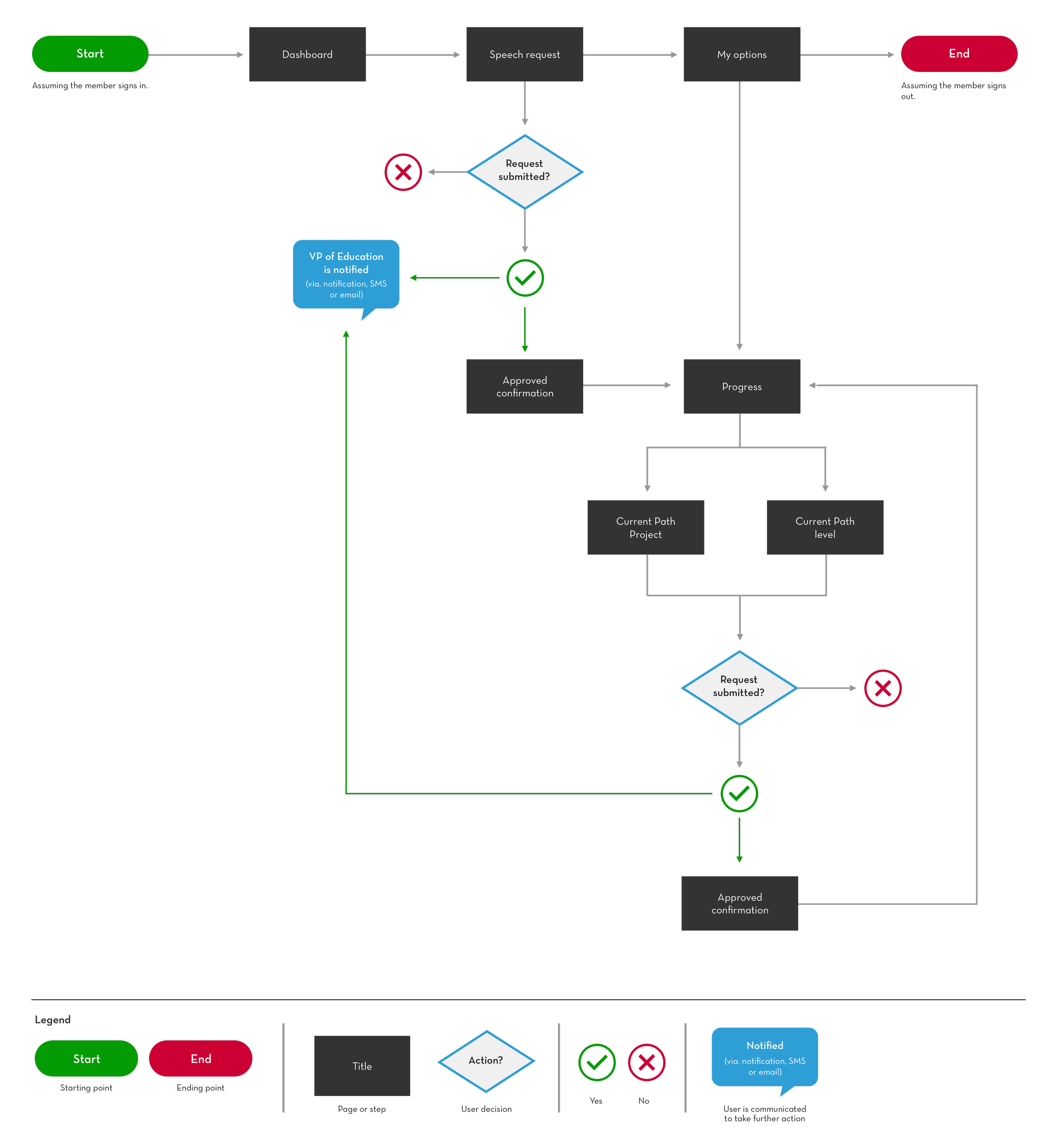
Mapping out the desired experience through a user flow
At this point, I was ready to map out a user flow that typically describes the users’ interactions of the platform. An example of user scenarios that required me to think critically was when a member requests a speech and sets their Pathways goals to get approved by the VP of Education.
User flow: When a club member requests a speech and sets a Pathway goal
Presenting the desired experience with wireframes
With the defined features, I was able to apply them to the wireframes. I used these wireframes as a guide to present to my club members and gather feedback before jumping directly into designing the high-fidelity prototype.
Wireframes: illustrating the desired experience useful for designing the high-fidelity prototype
1.0 - Homescreen
The user views the dashboard.

1.1 - Menu/Options
The user can manage options.

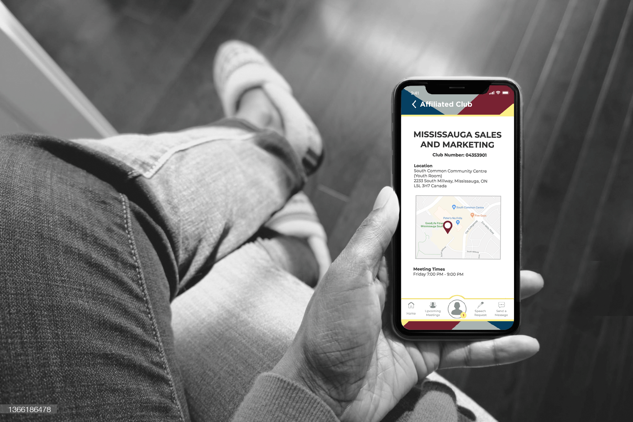
2.0 - Affiliated clubs
The user sees their affiliated club info.

3.0 - Calendar
The user accesses the calendar.

4.0 - Upcoming meetings
The user views upcoming meetings

4.1 - Meeting agenda
The user views the meeting agenda.

5.0 - Progress
The user can track and monitor progress.

5.1 - Edit path goal
The user edits date of completion of Pathway.

5.2 - Submitted target date
The target date is confirmed for completion.

6.0 - Notifications
The user texts to send a message.

6.1 - Opened notification
The user reads an opened notification.

7.0 - Message text
The user texts to send a message to a member.

I was ready to bring my wireframes to life through this hi-fidelity prototype
After a couple of iterations based on my pain-points as a club member, I combined my user flow, wireframes and visual designs into designing the high-fidelity prototype. Having an interactive prototype helped club members understand the benefits of using this mobile-based platform within a remote setting.
In addition to demo on the right, I am sharing access to the linkable prototype for anyone who’s interested in exploring the redesigned experience on their own.
Leveraging Toastmaster International’s branding guidelines with my visual design ideas
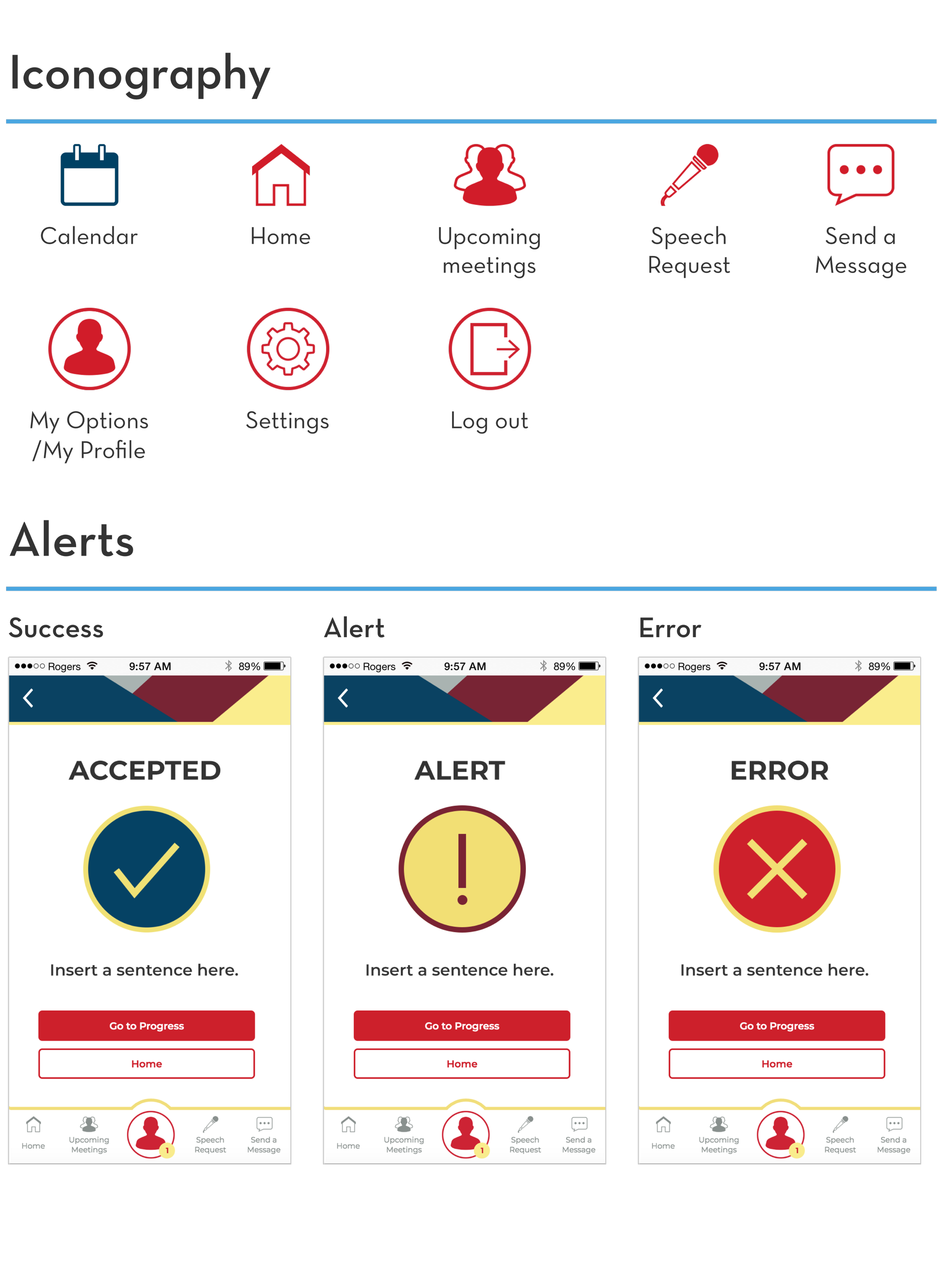
The visual layout and design of this mobile app are influenced by the branding guidelines of Toastmasters International. Also, I redesigned the logo because I felt it needed a fresh new look and professional identity to target this product to the appropriate audience. Since it’s targeted to Toastmasters club members only, I felt that it was best to correlate the new logo with the Toastmasters International brand. As per the branding guidelines, I used their, typography and other visual design elements to positively convey the organization’s message to then incorporate them into the prototype.
Visual design: Branding, text fields, iconography, UI functional components and alerts

4 - Validate
Validating my prototype with end-users: club members
As mentioned, I obtained validation of the prototype based on feedback from the club members.

Here’s a summary of some qualitative findings of club members

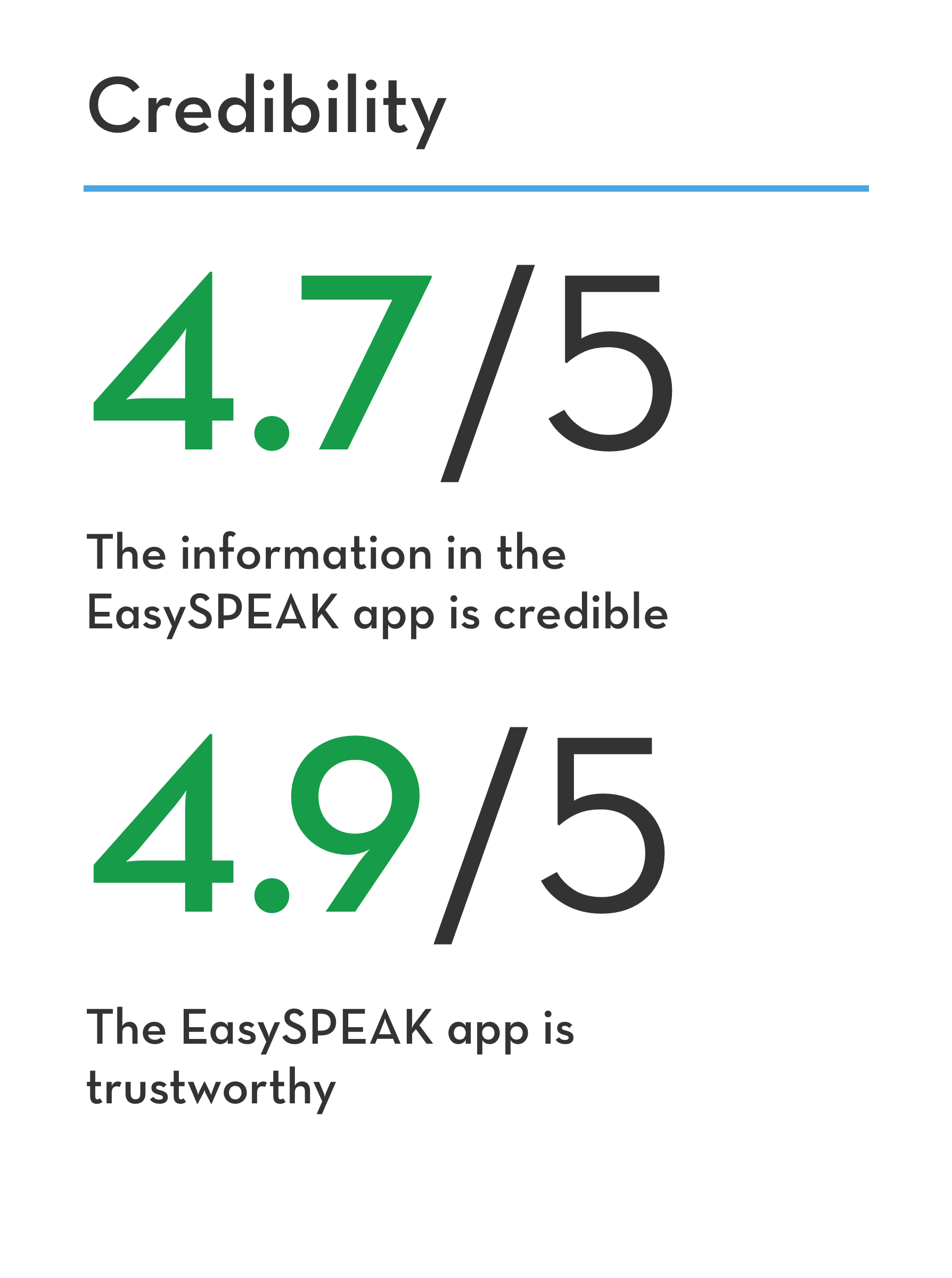
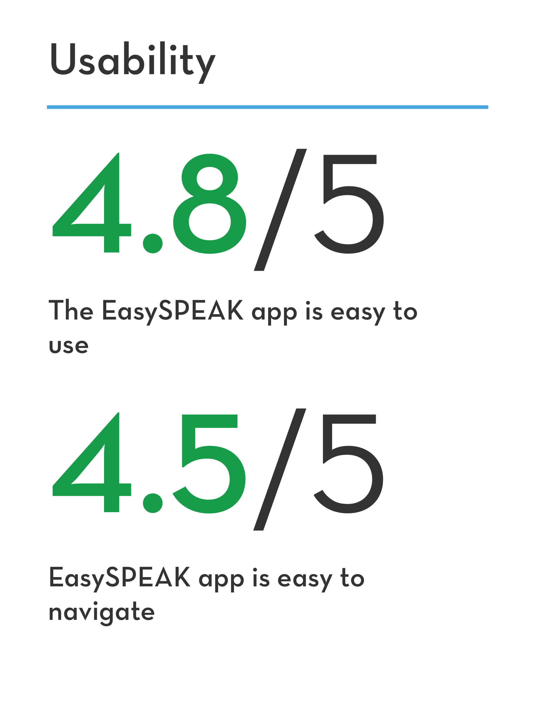
Some SUPR-Q & NPS questions to make the testing experience as seamless as possible for my participants
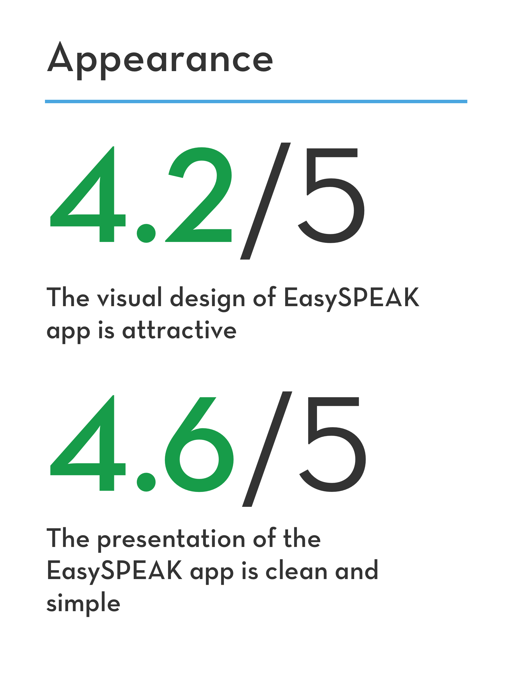
While my participants have limited or no understanding of user experience and based on the average age of Toastmaster International members, I focused on making my questionnaire of my testing session as seamless as possible for my club members while they were using the prototype. So I used a standardized User Experience Percentile Rank Questionnaire that simply measured their perceptions around several categories such as, usability, credibility, appearance, and loyalty based on a 5 scale rating (1 being the lowest and 5 being the highest). The high points captured from my findings were that members found the platform usable and credible. The low points not only focused around appearance but also loyalty as they noticed some missing features that could have benefited their needs.
The average scale for each category is calculated below:
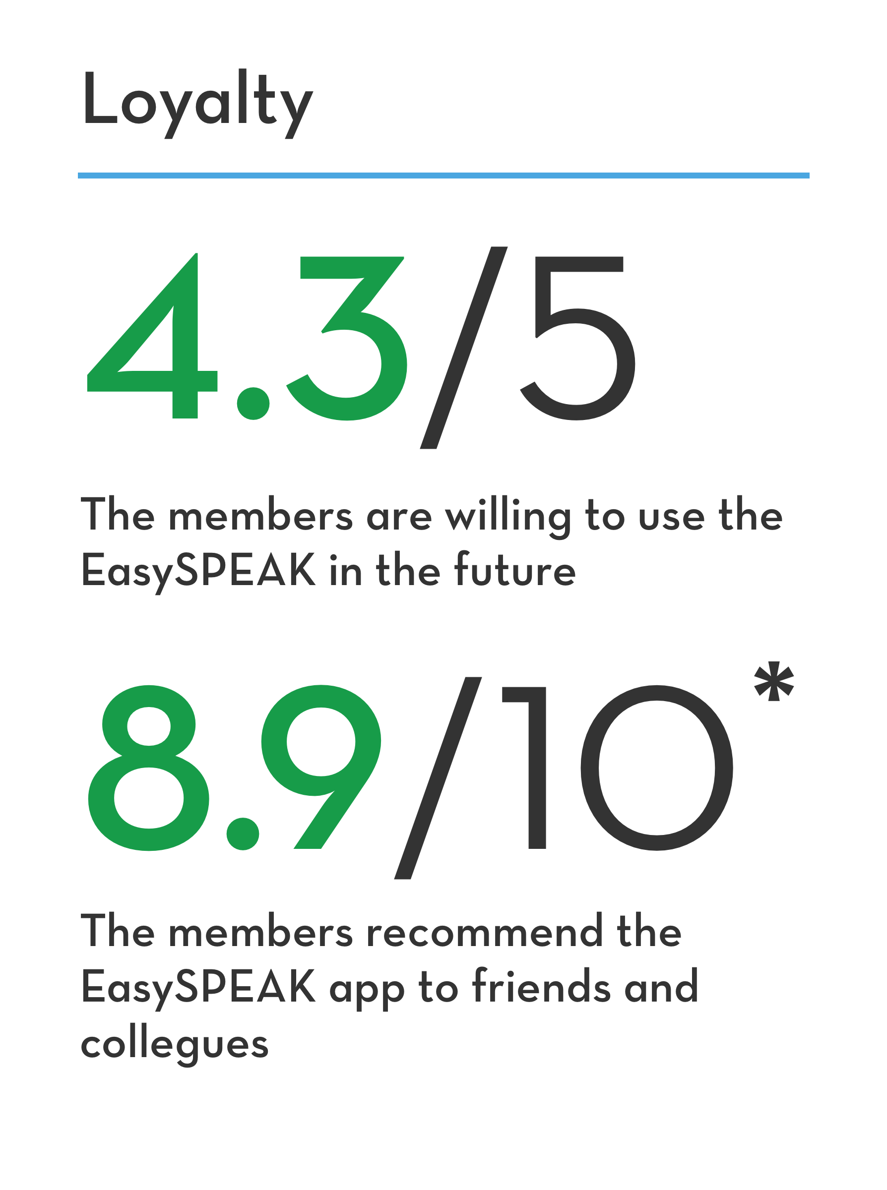
Since this project has never been introduced publicly to the sponsors and creators of EasySPEAK, it is currently on the back burner and is meant to be a minimal viable product (MVP). Additional features were proposed from club members during usability testing, but have not been introduced in this prototype yet.
*The net promoter system (NPS) is based on a 10 scale rating (1 being the lowest=detractors, 6 being mid-point=passives and 10 being the highest=promoters).
My biggest win of this experience: Giving back!
This experience was rewarding because I was allowed to give back to my club and the community. I deeply empathized with my members from diverse backgrounds, age groups, and professions while using my creativity and problem-solving skills.
Also, what interested me from this experience was the enthusiasm of a few club members. They suggested pitching this idea to Toastmasters International headquarters and the sponsors of EasySPEAK. If the concept is approved, then there will be a possibility to collaborate with these parties to deploy this product.