
Epic Fail Prototype
An educational game that empowers boys to become comfortable with failure through trial and error.
In association with the concept of today’s pop culture, Epic Fail fosters creativity, exploration, experimentation and the encouragement of taking calculated risks. The objective of the game is to empower boys to embrace the idea of making mistakes in a safe learning environment.


The challenge
For the purpose of defining TVO’s next product based on its strategic direction, we worked towards coming up with an innovative idea that addressed our problem statement. Based on the current statistics that addressed the issue of boys dropping out of school as early as grade 5 (ages 10-12) in Ontario, we were assigned to focus on the following:
“How might we encourage boys to stay engaged in learning and education?”
The goal
To create an interactive learning game that can encourage boys to experiment and fail in a safe learning environment.
End-users
Epic Fail is conducive for boys ranging as early as grade 5 (ages 10-12). There were conversations that it could be introduced it to ALL types of elementary students.
My role and process
My role in team working on this 2-week Design hackathon
Working with 6 multi-disciplinary team members across the whole organization using Google’s Design Sprint model, I collaborated with them on the research and led the experience design delivering the interaction, illustrations and visual design of the prototype.
1 - Discover
Researching through data analytics and subject matter interviews
We examined the problem by conducting these methods of research such as:
Analyzing statistics, case studies and other scholarly documentation that justified the reasoning behind the high dropout rate of boys, as well as a comparison of literacy between boys and girls.
Interviewing a Master’s candidate whose research specializes in the psychology and behaviour of young boys.
Summarizing our findings at a high-level, we discovered that boys often:
Learn and explore by tinkering with problems in their quest for answers.
Compete in groups while they have a fear of losing in front of their friends or peers.
Due to confidentiality reasons, I haven’t disclosed full data insights in this case study.
Defining our end users’ needs and wants with a persona based on our research
We used our findings to create a persona that summarized our end-user based on desires, dislikes, goals, motivations. Based on these key areas, this persona informed us about how boys generally feel, think and interact when they are being volunteered to answer a question amongst their friends and peers in the classroom.
Persona: Our primary user that well-summarized our-end user needs and wants

User journey mapping helped us empathize with our persona’s experience in the classroom
Using the persona we created, we constructed a user journey map representing Greg’s actions, thoughts and emotions in the classroom. Creating a customer journey map promoted us to pinpoint Greg’s frustrations with his experience and discover potential learning opportunities that helped us define viable solutions for our users.
Journey map: fully outlines Greg’s actions, throughs and emotions in the classroom

2 - Define
Using our research to define our value proposition and ideate a workable solution for our persona
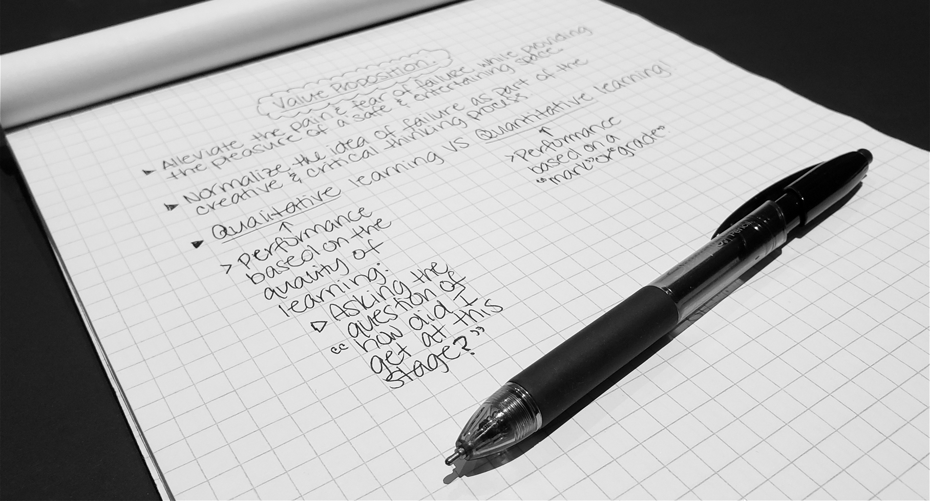
At this point, we evaluated what we learned and discovered from the research stage through discussion for which we defined our value proposition.
We referred to our value proposition and customer journey map to ideate possible solutions and narrowed them down into one solution. We came up with Epic Fail because our problem statement complemented a safe space of learning where boys can comfortably experiment and fail while being engaged in the process.
Having this idea as our solution, we focused on delivering a universal-browser based platform that:
Consists of interactive activities such as mini-games for users with short attention spans.
Promotes users to build and reinforce their self-confidence in learning so they can engage in activities that allow them to feel comfortable with trial and error.
Follows the Ontario Educational curriculum.
Applies visual, textual and auditory features for an intuitive and pleasurable user experience.
Is responsive across all desktop, tablet and mobile devices.
3 - Design
User flow mapping proved useful when articulating our idea visually
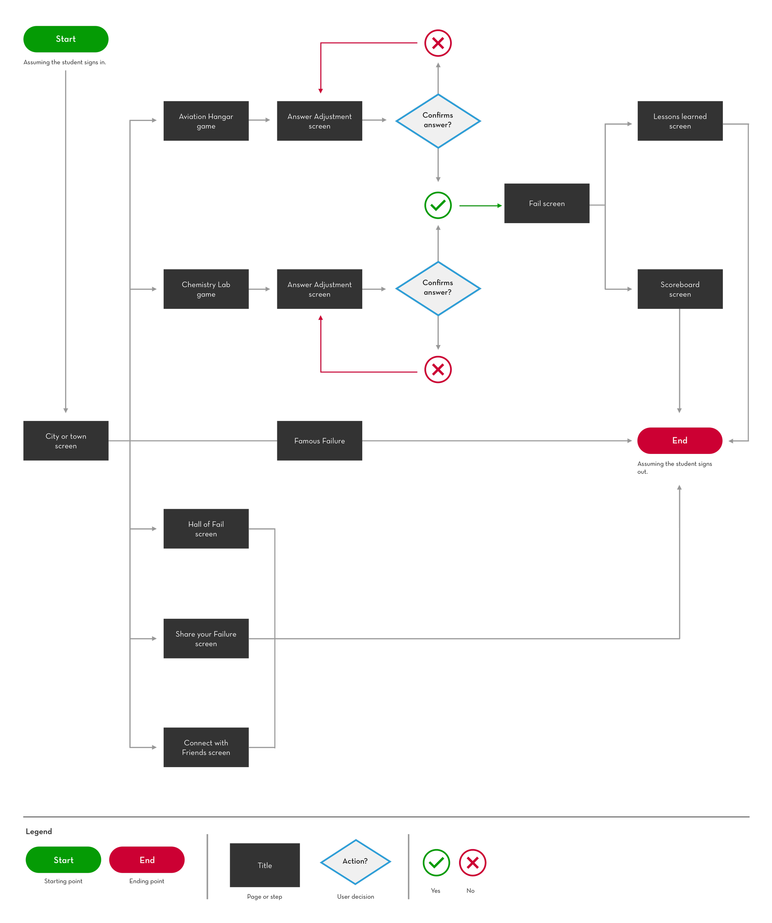
Applying the features that we planned for our concept, I crafted a user flow to help us see how our end-users can interact with the platform.
User flow: Student signs in and plays the games
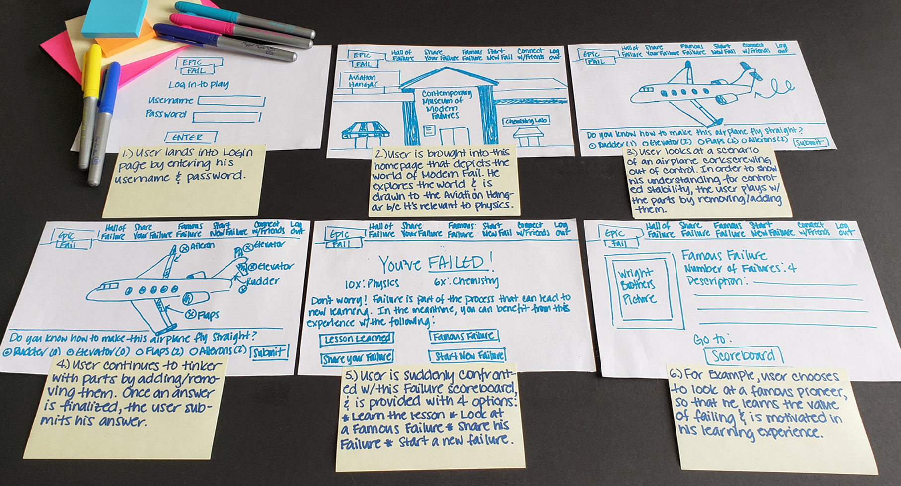
Low-fidelity sketching encouraged team collaboration of weaving their ideas into a simple prototype
With the user flow and features that helped define our concept, I translated these into sketching out this low-fidelity design. I presented these to our team meetings. Minor tweaks were suggested by my team lead as he helped me with the language. To ensure a successful pitch, I redid my sketches based on the feedback received (see final version below). As they were pleased with the fact that I took the liberty to illustrate our concept with storytelling, it encouraged me to design a high-fidelity prototype that enabled us to clearly articulate our concept during our pitch.
Low-fidelity sketches: A preliminary design of our concept
4 - Prototype
Our high-fidelity prototype contributed to the successful pitch of our concept to TVO executives
I compiled all of our deliverables generated from this design challenge and used my visual and UX design skills to bring our prototype to life.
Showing an interactive prototype helped us successfully pitch our idea to our stakeholders at TVO because it allowed them to see the big picture of where our concept is going when users interact with the platform.
High-fidelity prototype: displayed in a browser (mobile)
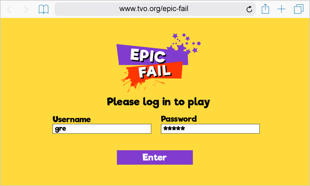
0.0 - Login
User enters login information
1.0 - Homepage
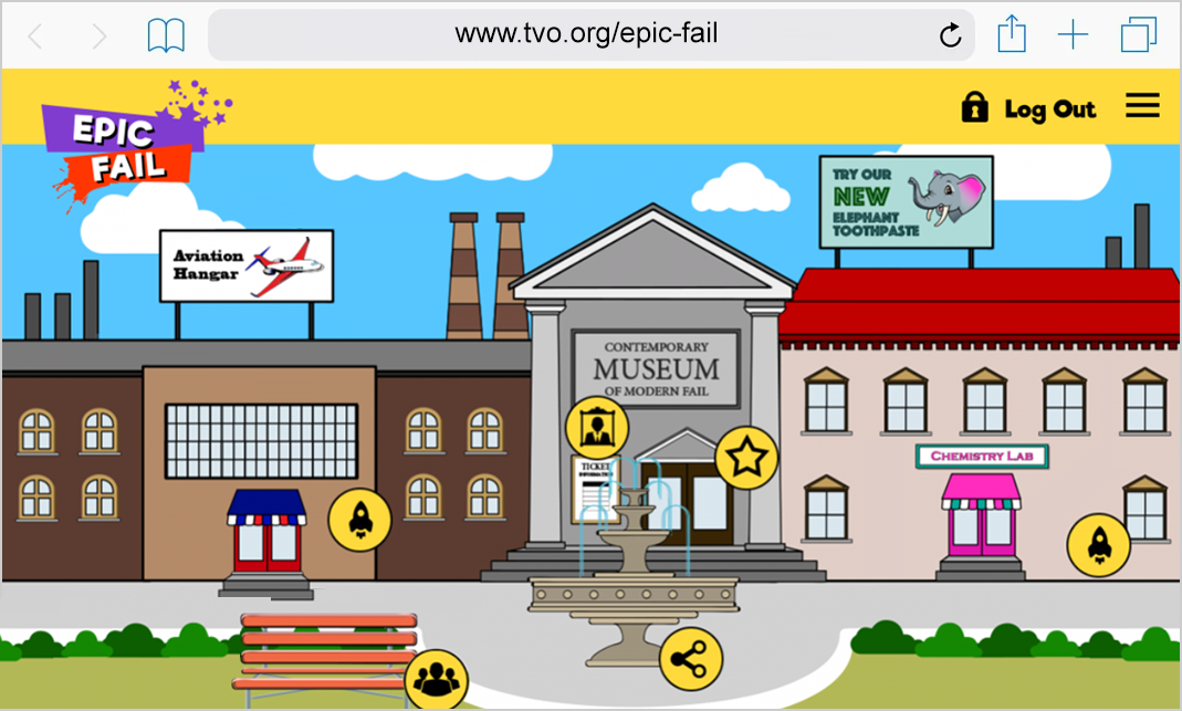
The user explores the town and chooses an activity.
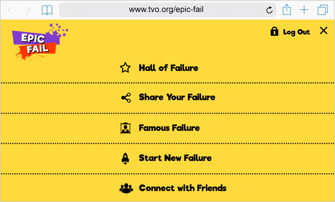
1.1 - Main menu
The user chooses navigates the website.
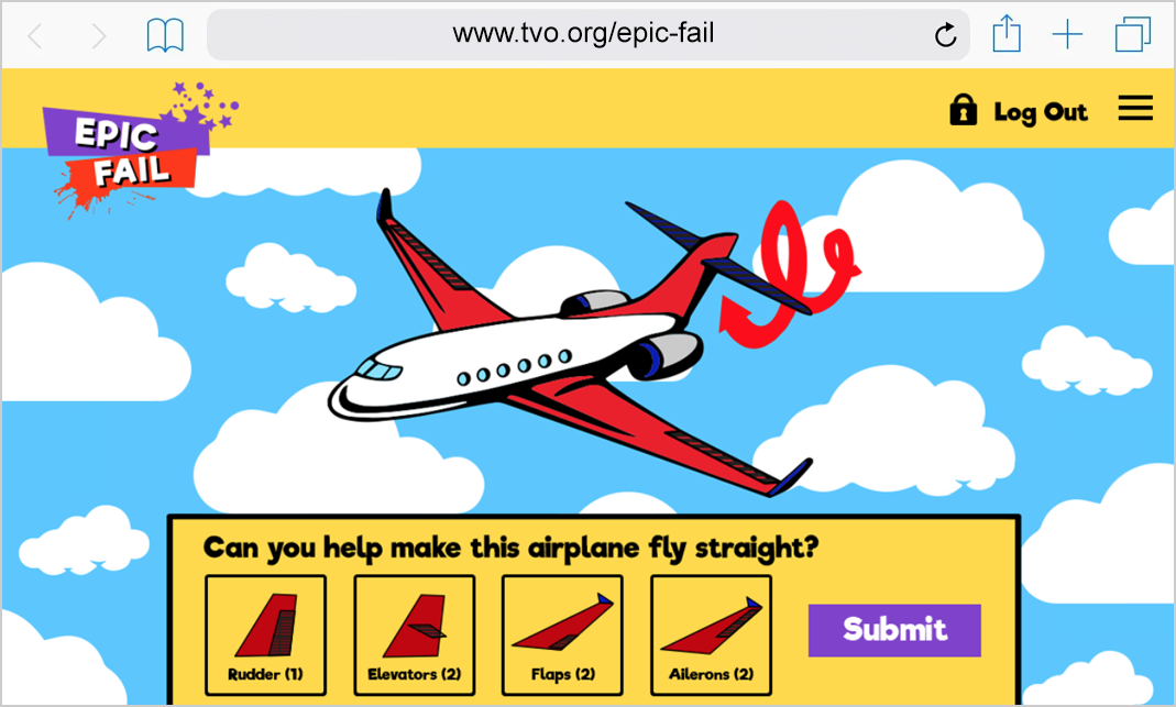
2.0 - Aviation Hangar Game
The user plays the game to solve the problem.
2.1 - Edit Answer in game
The user has the option to change the answer.

2.2 - Confirm Answer in game
The user confirms the answer before submission.
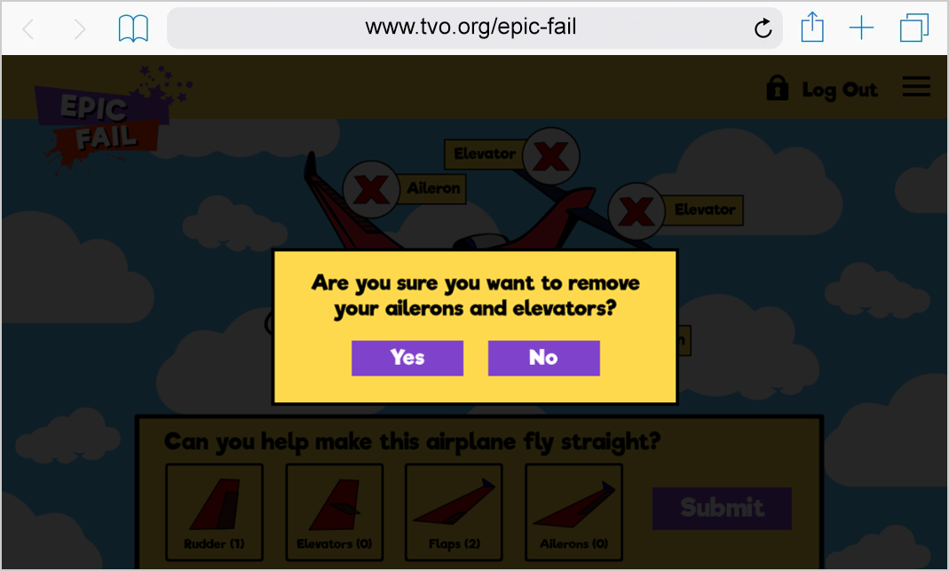
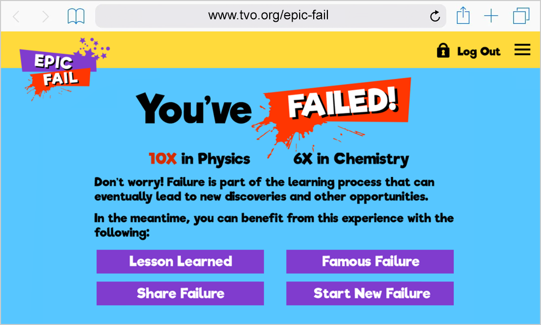
2.3 - Failed screen
The user is confronted with this screen with the following options.
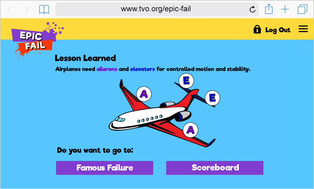
2.4 - Lessons Learned
The user explores the Lessons Learned after playing the game.
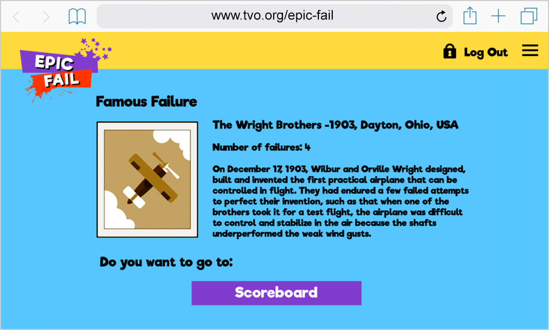
2.5 - Famous Failure
The user explores a Famous Failure for inspiration.

A happy ending to this story
Not only this prototype clearly articulated the solution to the given problem but also sparked positive responses as we showcased our prototypes to all the employees throughout the organization. During our pitch, one of the educators agreed that failure should be embraced as it encourages successful learning for boys in a safe learning environment.
As a result, Epic Fail ranked 1st amongst the 11 teams competing for TVO’s Design Sprint Challenge.
Legacy of Epic Fail and my lessons learned
Before I departed from TVO (end of March 2018), we left it up to the executive leaders and other key stakeholders to decide whether it was ideal to roll it out as the TVO's next end-product. As far as I know, based on the status and legacy of Epic Fail, it was on the back burner due to reasons beyond the company’s control (i.e.: scope, resource and cost constraints, and timing).
After my employer encouraged me to participate in this challenge, I am glad I did because I found this experience both enjoyable and fulfilling. Despite that I worked with some individuals who I never met from different departments in the organization, I though we had a strong team dynamic where our unique talent and creativity came together to achieve a common vision. As the only UX designer in the team, I applied my unique skills, such as my experience design and illustration skills to prototype our concept. Since mPower were one of the initiatives that I worked on with 1 Product Manager and 2 Software Engineers in my team, it drew inspiration for me to design an experience that well complemented our end-users needs, wants and goals. This enabled us to successfully define the next generation of digital educational platforms with the power of learning for Ontarians.
Credits to my team
Hats off to my amazing and bright teammates (Atiya Sobhan, Derek Turney, Irina Labuac, Jody Yvonne, Kevin D’Innocenzo and Richard Roylance). I enjoyed working with them during this design challenge where we shared our ideas and had fun in the process. Also, I would like to thank the Director of Product, Cara Yarzab for encouraging me to participate in this activity. My contributions wouldn’t have been possible without their ideas, effort, and support.