
Mathify Digital Platform Wireframes
Mathify provides free tutoring services that help grade 7-10 students brush up their math skills, as well as learn new concepts at their own pace through one-on-one virtual chat sessions with tutors. They can interact with this platform using a live whiteboard for which they can write or draw out math problems and access a learning portfolio of their recorded live sessions and personalized lesson plans.
An interactive math tool that allows tutors to help students overcome their challenges in math and build confidence in learning.

Platforms
Responsive web:
Desktop
Tablet
Mobile
Company
TVO
Project duration
Jan. 2017 – Mar. 2018
Tools used
Adobe Creative Cloud/Suite:
Adobe Illustrator
Adobe Photoshop
Axure

The challenge
After the 1st refresh of the platform in the fall season of 2016, there was a need for a 2nd rebuild because the platform supported outdated technology as students reported a poor user experience that failed to accommodate their applied learning needs. So we focused on:
“How might we increase adaption rates, utilization and retention to ensure this platform provides a better user experience to accommodate students’ learning needs?”
The goal
To modernize the platform and provide a hands-on learning experience for students to interact with their tutors live using a whiteboard and access personalized lesson plans so that they boost their confidence in learning.
Measuring success (KPIs)
Success task rate:
When students select and seamlessly connect with a tutor for an online session with very minimal time. Success task rate is also measured through the completion of an Exit Survey, which helps TVO improve the digital experience for tutors and students alike.
Engagement:
To ensure students show interest in applying their learning through the whiteboard.
Conversion rate and active/returning users:
After tutors and students sign up for an account online, TVO needs to ensure they are using the product on a regular basis.
User satisfaction:
If tutors and students are satisfied with this product, it is highly likely they would recommend it to other schools in Ontario, which in turn helps improve the conversion rate. Also, user satisfaction indicates that students are finding the platform enjoyable to use as it meets their learning goals and boosts their confidence.
End-users
Mathify is used by grades 7-10 students and certified Ontario educators and tutors.
My Role and Process
My role in the team
Working with key stakeholders and cross-functional teams, I collaborated with the BA, Product Manager and Educators (teachers) on the research and defining the requirements of the platform. I led the experience design, content management, interaction and layout of the wireframes.
1 - Discover
Our data analytics allowed us to understand the reasoning behind the low ratings
Since the first rebuild was launched in September 2016, there was no need for initial user testing. Instead, we gathered insights from our analytics team and collected feedback from tutors and educators.
When we analyzed the data, it became clear that we needed to understand the factors behind the low ratings. Although I am unable to share specific quantitative data due to confidentiality, I can summarize some of the key issues identified:
Users reported that the platform did not support the latest browser technology.
Student engagement was low, partly because the platform did not allow them to apply hands-on learning on a whiteboard, a feature restricted to tutors, creating a one-way system.
The platform was not responsive on tablet or mobile devices, limiting its accessibility for students.
After thoroughly understanding these issues, we addressed the problem by starting with persona development and a competitor analysis.
Defining our end users’ needs and wants with a persona based on our assumptions gathered from research and feedback from Educators
Using our competitor analysis combined with our user analytics, including the feedback collected from Educators, we designed two provisional personas (primary user and secondary user) that helped us address our assumptions about the end users. We revisited these documents often because we needed to be reminded of the pain-points and needs of our users when we defined and designed our platform.
Primary persona: The struggling student

Secondary persona: The successful and competitive student

Using our insights to frame the problem through a competitor analysis
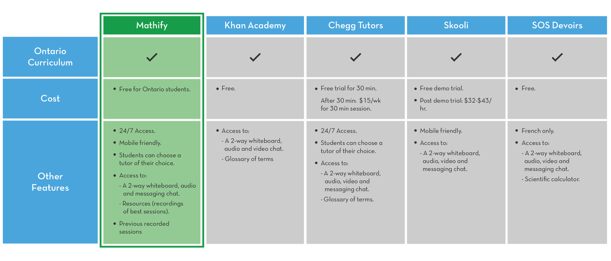
A competitor analysis was completed to help us weigh the pros and cons of other platforms. Looking at the competitive landscape was useful because it got us inspired by ideas that helped us define the features of our newly designed platform.
Competitor analysis
Spotting the initial problems and missing components in the website through affinity mapping
Putting myself in the position of the user, we explored the original platform and compared it with the free trial of our competitors. Going through the information architecture in our platform, we noticed a few problems and categorized them into an affinity map. Our affinity map indicated that our platform has the potential to include features that can better meet the needs of students when they interact with their tutors online.
Affinity map

2 - Define
Summarizing our research into defining our requirements & features to prioritize based on user needs and business goals
I met with my stakeholders and ensured that my observations aligned with their thinking and supported the user data. Once I gained validation from key stakeholders, I worked with the team to discuss what features needed to be kept, as well as the possibility of replacing features that served little or no value to the user with new and enhanced ones. In order to improve the overall user experience of this platform, we provided users with the following enhanced features:
24/7 Access to a personalized learning portfolio where students can store their recorded live sessions and refer to their learning resources created in partnership with Ontario educators.
One-on-one interactive live chat sessions where BOTH tutors and students can take advantage of the new tools in the whiteboard such as the glossary, upload/download capabilities, and two-way audio.
Personalized lesson plans and activities that are conducive for individuals, small groups and the whole classroom.
A responsive browser that can be accessed across various devices.
3 - Design
Using content management to map out our defined features and requirements for our MVP
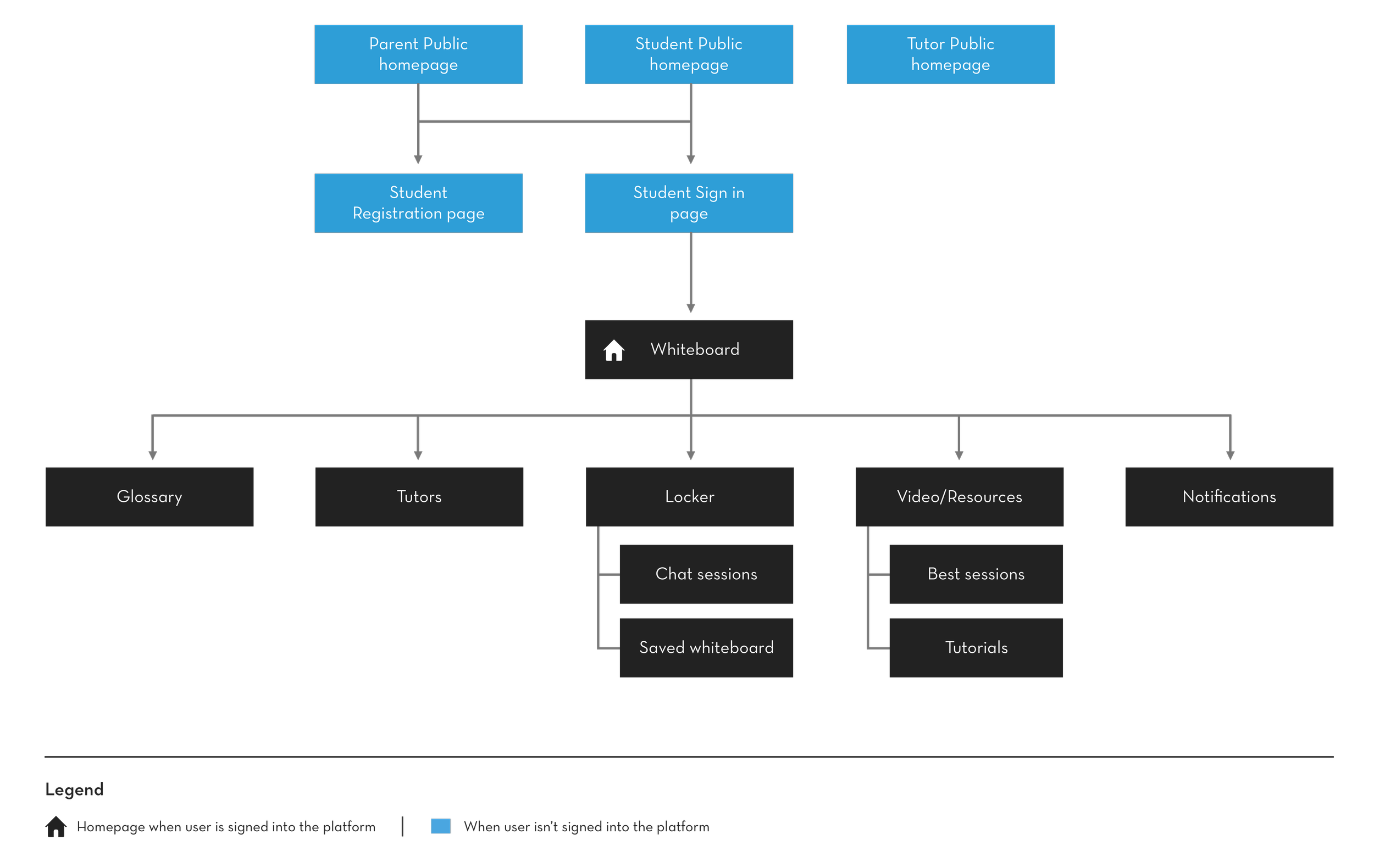
After we defined and prioritized our feature list, it was time to design our content management to enhance the findability and improve the interaction when students and tutors are using the platform. Site mapping the required features that we originally had on the current website along with new ones allowed us to organize our content for the redesigned platform.
Sitemap: for the planned website
User flow diagramming uncovered worst-case scenarios
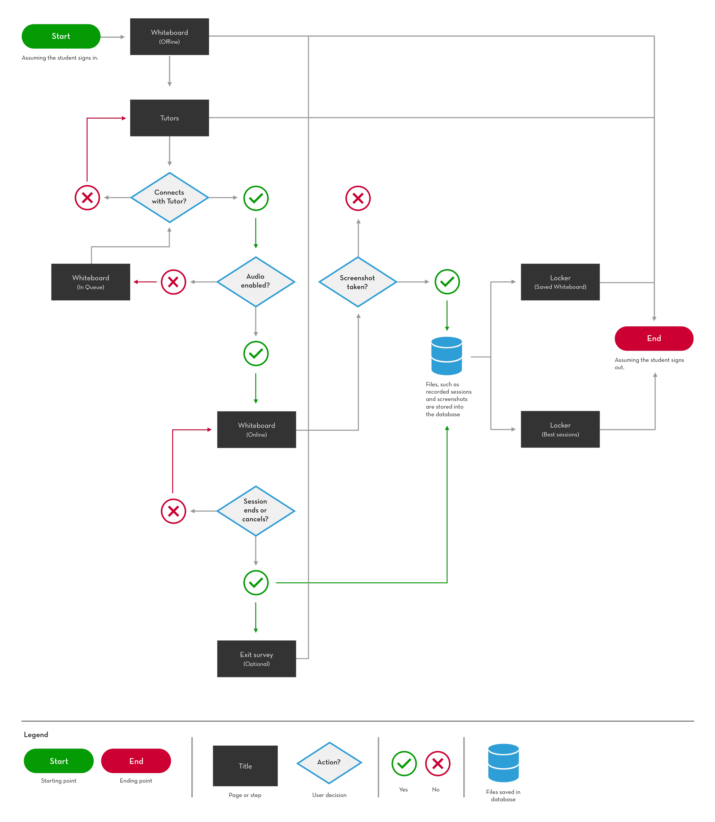
After we defined and prioritized our feature list into our user stories and presented them into a site map, a user flow proved useful because it uncovered the challenges that we could’ve faced later while building the platform. An example of a worst-case scenario was the 2-way communication when students wanted to choose a tutor of their choice but find themselves in queue if their chosen tutor is busy with another student or not available. We rectified it with solutions where students can connect with their other tutors of their choice or depending on the number of students in queue, they can multitask in the whiteboard while they wait.
User flow: An example of a worst-case scenario of a student connecting online with a tutor and a recorded online session is saved
The user flow informed our design decisions through the 1st iteration of wireframes
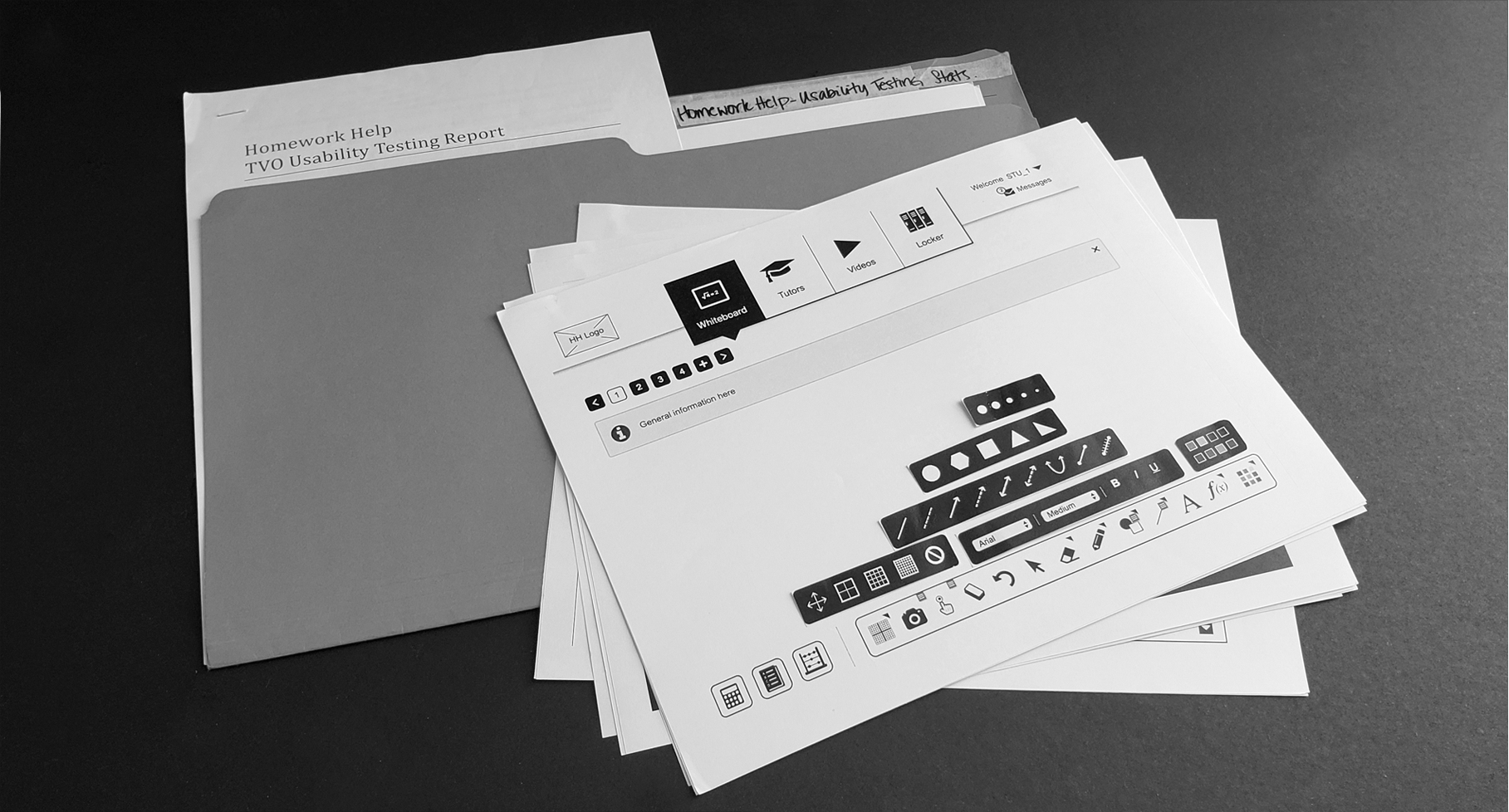
By referring to the user stories, site map and user flow, I attempted to execute the 1st iteration of wireframes. After validating it with our stakeholders, we used this draft as paper prototyping to conduct our 1st round of usability testing with our stakeholders and TVO employees who were parents and/or guardians.
1st iteration of wireframes
Whiteboard: Offline
The user lands into the whiteboard while offline.
Whiteboard: Glossary
The user opens the Glossary from the Toolbar.
Tutors
The user picks an online tutor or favourite it from the list. They can instantly connect to a session or ask a question in advance.
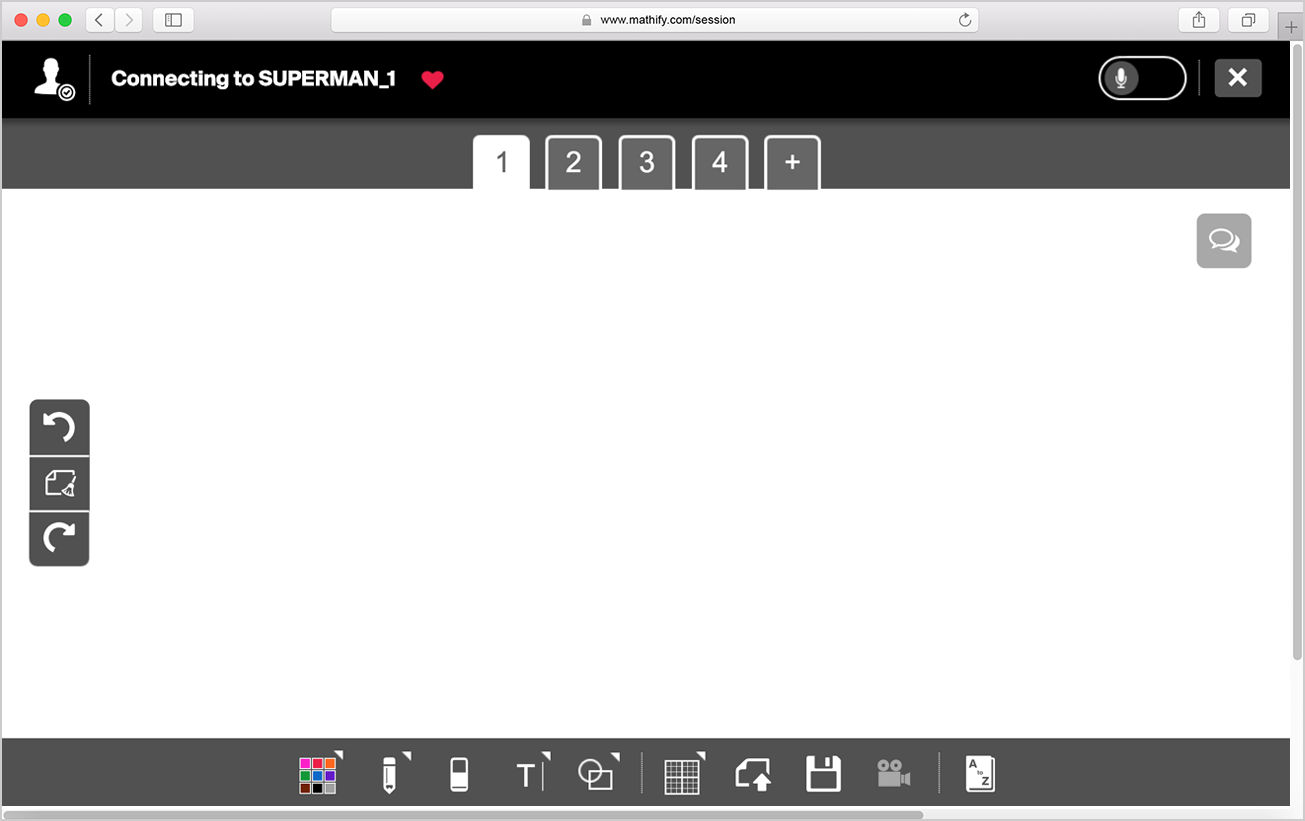
Whiteboard: Connecting online
The user waits for a tutor to accept the request. The user can see the students in queue, select their audio preferences or cancel their request.
Whiteboard: Calculator opened
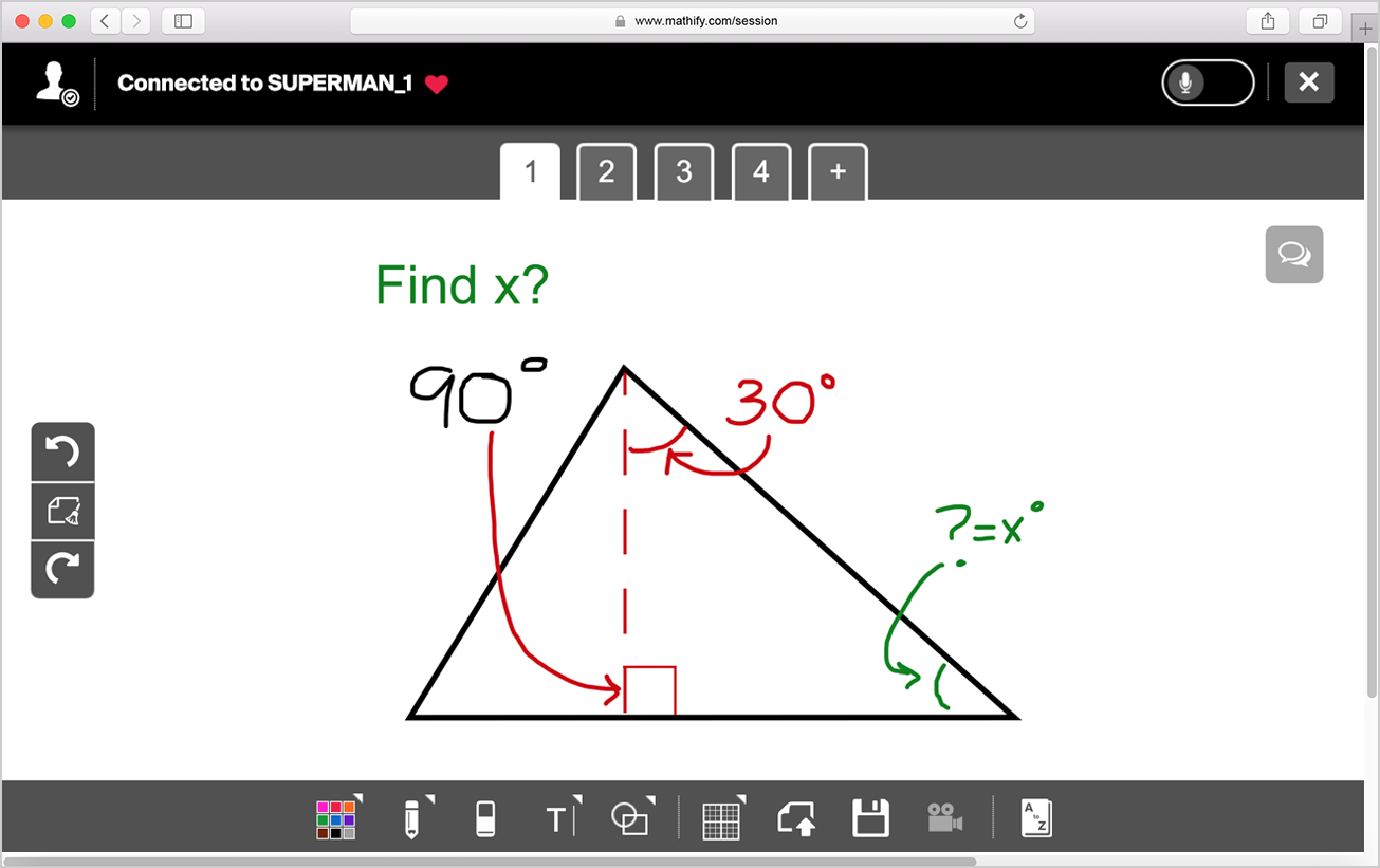
The user is connected with a tutor. The session is in progress with a calculator and chat-box opened.
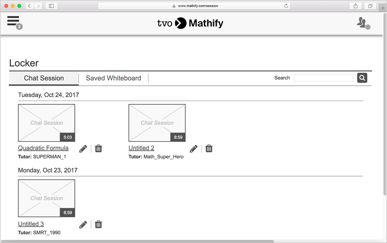
Locker: Chat Sessions list
The user accesses the recorded Chat Sessions from the list in the Locker section. They can delete the sessions if they wish.
Video: Best Session list
The user accesses the recorded Best Sessions from the list in the Video section. They can sort by title, subject or length or search for a specific video.
Video: Opened Best Session
The user opened a Best Session from the list in the Video section. They can access related Best Sessions or search for a specific one.
Message/Notification
The user opens a notification from their message
box.
Usability testing informed us with the 2nd iteration of wireframes
After round 1 of usability testing, the wireframes were iterated based on the feedback shared by parents.
After deciding on a 3rd party vendor to build our platform, there were some technical constraints with the 1st design of wireframes. One of them was that the navigation bar wasn’t intuitive for smaller devices. I redesigned this portion of the screen to accommodate students and tutors who are using phones.
Wireframes (2nd iteration): Navigation (before connecting with tutors and during online sessions) experience in mobile view
Wireframes (2nd iteration): Feedback was applied from our 2nd usability testing session and our vendor. These were handed-off to the Visual Designer Lead from Marketing
Whiteboard: Offline
The user lands into whiteboard while offline.

Tutors
The user picks an online tutor from the list.

Whiteboard: Connecting online
The user is waiting online for a tutor to accept the request.
Whiteboard: Connected online
The user is connected with a tutor. The session is in progress.
Locker: Chat Sessions list
The user accesses the recorded Chat Sessions from the list.
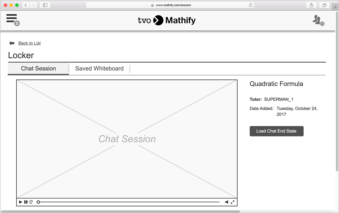
Locker: Opened Chat Session
The user opened a Chat Session from the list in the Locker section.
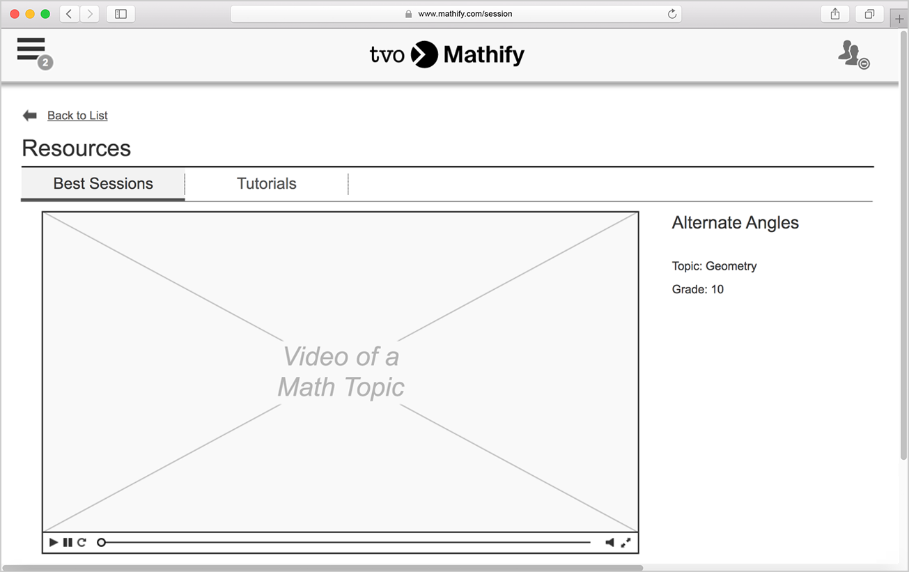
Resources: Best Sessions list
The user accesses the recorded Best Sessions from the list in the Video section.

Resources: Opened Best Session
The user opened a Best Session from the list in the Video section.

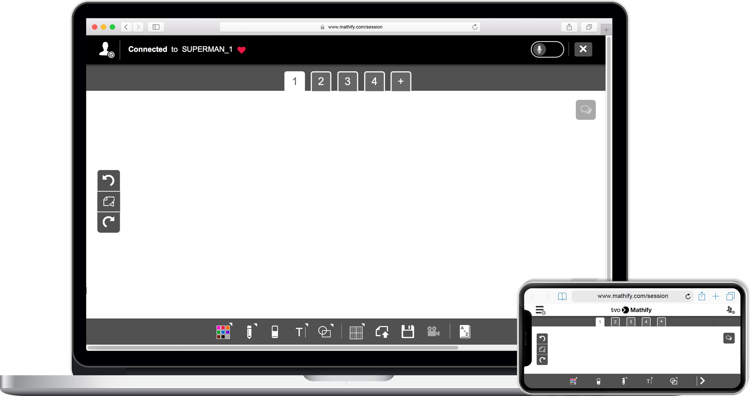
Wireframes informed and guided the creative Marketing team in designing the high-fidelity mockups
For the first time, the idea of introducing clickable wireframes gave stakeholders a visual sense of how our end-users would interact with Mathify. Additionally, it served the purpose of guiding the Marketing team to bring our concepts to life with a high-fidelity version (see left) of our prototype.
For anyone who’s interested in seeing the end product with the final look and feel, please watch this demo on YouTube (credit: TVO).
Note:
The high-fidelity mockup shown in the picture on the right was designed by Ignacio Ponce.
4 - Validate
Using our wireframes to validate with our end users for iteration with high-fidelity mockups.
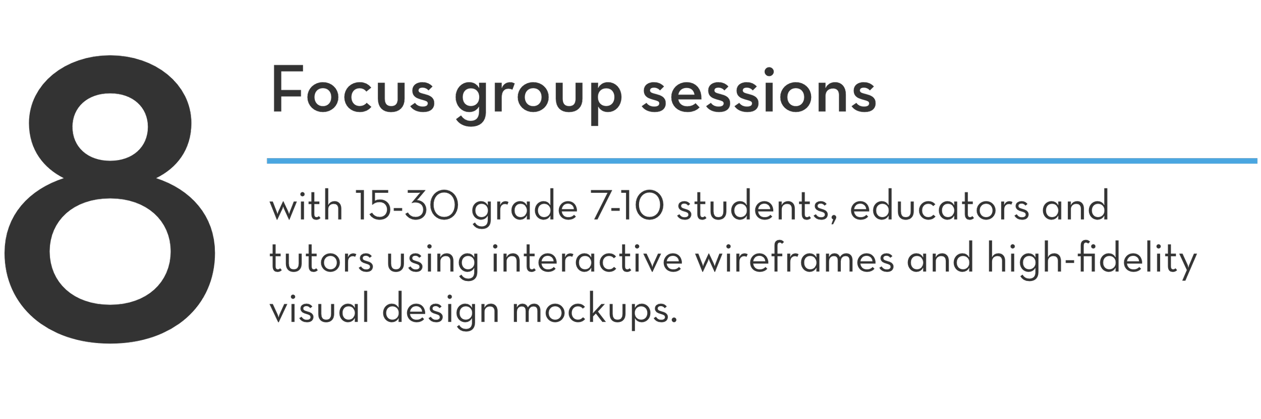
I continuously iterated the wireframes as we progressed on further defining the features from our list so that we can validate our designs through these methods of usability testing:

With minor suggestions, the candid and constructive feedback from the user testing sessions allowed us the confidence to validate our designs to pass on to the vendors for building the platform. The first iteration was meant to be a minimal viable product (MVP) since many planned features were excluded from the wireframes because of time, scope, resources and technological constraints. These features may be considered in future iterations depending on the user needs in the market.
Embracing the major WINS of our experience despite the constraints
I didn’t expect to hear positive feedback when we showed our designs to our internal and external stakeholders, such as our vendor, participants from our testing sessions, and the TVO executive team, including the CEO. Thus, the interactive wireframes led us in the right direction of launching Mathify publicly engaging thousands of students across the province. Testing our designs with our end-users and receiving constant feedback was crucial for TVO to consider best human centred design practices and accommodate the learning needs of Ontario citizens.
Credits to my team
Credit goes to the Product (Cara Yarzab, David Gaudet, Dennis Van Dine, Ken Wong), Marketing (Aaron Ries, Christine Harris, Ignacio Ponce, Jude Kahn), Project Manager (Asha Scipio), Web and Mobile Development (Angelo Porretta, Tom Ryan, Uzma Khan) teams, including our educator stakeholders (Carolyn Gallagher, Katina Papulkas, Urs Bill) at TVO and our 3rd party vendor (Skooli).